Avoid matching two primary colors (red, green, and blue) or two secondary colors (those born from the mixing of the first ones, such as orange, purple, or green) clothing color matching Color matching is an important element in many fields such as art, design, and clothing. It not only affects the overall effect, but also expresses emotions and highlights the theme. Although color combinations can be played freely according to creativity, some combinations may make people feel inconsistent or uncomfortable due to visual conflicts or the effect of color psychology. Therefore, it is very necessary to master some basic principles of color matching and avoid inappropriate color combinations.
Similar colors refer to adjacent colors on the color wheel. Usually, this combination will look more harmonious. But if these colors are too close, there will be a lack of sufficient visual contrast, which can easily make the combination monotonous and boring. For example:
Light yellow and white clothing : These two colors are very similar in brightness and hue. When paired together, the visual effect is easy to appear insipid and boring, lacking layering and focus. Especially when worn, the skin color often appears dull and lacking vitality.
Dark blue and dark green clothing : Both colors belong to the cold color system. When paired together, they can easily give people a feeling of boredom and depression. Especially when used in a large area, the lack of visual freshness can make people feel heavy.
In addition, you should also avoid matching the same color tone for the whole body. Even if it is the same color, if it is not distinguished by changes in light and dark, depth, the overall effect is likely to be monotonous, boring and lacking visual attention and hierarchy.
Contrasting colors (complementary colors) are usually on opposite sides of the color wheel and their combination often produces a strong visual impact. If used improperly, these colors will appear glaring and too ostentatious:
Red and green clothing : This is a classic contrasting color combination, which usually appears on festivals or special occasions. However, in everyday use, the combination of red and green can appear too stimulating or even tacky. To avoid this visual conflict, you can choose low-saturation red and green or embellish them in a small area.
Yellow and purple clothing : These two colors are on opposite sides of the color wheel. When paired, they often produce strong visual conflicts and appear disharmonious. However, by adjusting their brightness and saturation, or using a gradient transition method, you can create a unique and individual effect.
Orange and blue clothing : The vitality of orange and the calmness of blue form a sharp contrast. If the proportions are not appropriate when matching, it is easy to appear abrupt and lacking a sense of balance. But in fashion design, reasonable control of the ratio of these two colors and the appropriate addition of transition colors can produce stunning effects.
Some colors often cause eye strain due to their extremely high saturation and brightness:
Neon and fluorescent colors: These colors are very stimulating to the eye, especially when multiple neon or fluorescent colors are combined, the visual effect is easy to produce excessive information impact, making people feel uncomfortable and tired. Excessive use of these colors will make the design messy and lacking in harmony.
Large areas of gold: Gold usually represents pomp and luxury, but if used in large areas, it may make the design appear too ostentatious and tacky. The use of gold should be moderate and it is best to combine it with other colors to avoid a single large-scale use.
However, some combinations, while not conflicting in color theory, may appear inappropriate due to culture, design, or actual use:
White top with suspenders clothing or black underwear: this combination may look unrefined if there is no special design sense. Especially when the top is thin and transparent, black underwear will not look elegant enough, affecting the overall quality and image.
Combination of black with other dark colors: For example, combining black with dark brown or dark gray can easily appear dull and lifeless. Especially for young people, this combination can seem mature or too old-fashioned.
Black pants and white shoes: this combination is relatively demanding. If it is not matched properly, it is easy to appear "overweight", that is, the visual proportion of the upper and lower body is not harmonious.
Although everyone's color preferences are different, and design should also change according to specific needs and environments, some basic color matching principles are still universal.
Similar color matching refers to choosing colors of the same hue and matching them by changing their brightness and purity. This method can usually create a unified, coordinated and layered effect, suitable for projects that require a simple and elegant atmosphere. For example, the combination of dark red and light red, dark blue and light blue usually presents a soft and elegant effect.
Adjacent colors refer to colors that are close to each other on the color wheel, which usually give people a delicate and harmonious visual experience. Common adjacent color combinations include red and orange, orange and yellow, yellow and green, etc. These combinations are suitable for expressing warm and comfortable emotions, and can create a rich sense of layering.
Contrasting colors refer to choosing colors that are far apart on the color wheel, such as red and green, blue and yellow, purple and yellow, etc. This combination can produce a strong visual impact and is suitable for projects that need to highlight key points or create strong effects. However, when combining, pay attention to the proportion and balance of colors to avoid an uncoordinated effect.
Complementary colors refer to two colors that are 180 degrees apart on the color wheel, such as red and green, blue and orange, yellow and purple, etc. Complementary colors can produce a sharp contrast, but they are also difficult to control. Be careful to adjust their proportions to avoid one color being too eye-catching and affecting the overall effect.
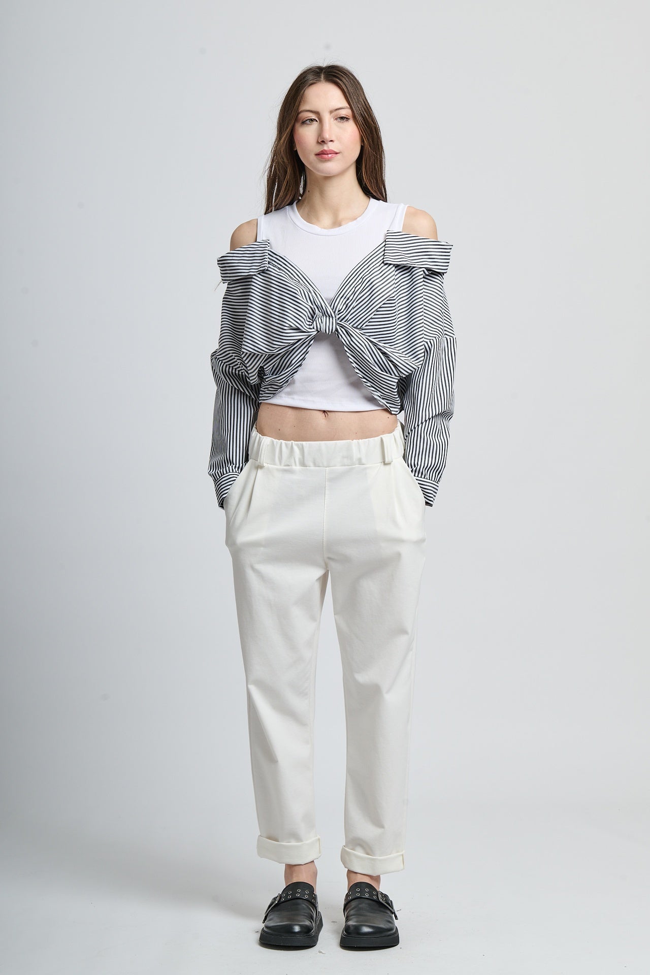
Neutral colors (such as black, white, gray, and brown) have a strong neutralizing effect and can be combined with other colors to create a balanced visual effect. Black and white clothing is a classic and timeless combination that can show simplicity and modernity; gray is often used to reconcile excessively bright colors and add a feeling of softness.
In design or clothing, the number of colors should be controlled within a reasonable range. Generally, it is ideal to match three colors. Too many colors will make the overall effect messy and difficult to focus. In clothing matching, the visual load can be reduced by using neutral colors reasonably.
Color matching is an art and skill that requires practice and careful observation. Although color theory provides many useful guidelines, the most important thing is to tailor the match according to the specific occasion and personal style. By using contrasting colors, adjacent colors, neutral colors and tones in a reasonable way, we can create a harmonious and expressive visual effect, which shows personality and taste.


